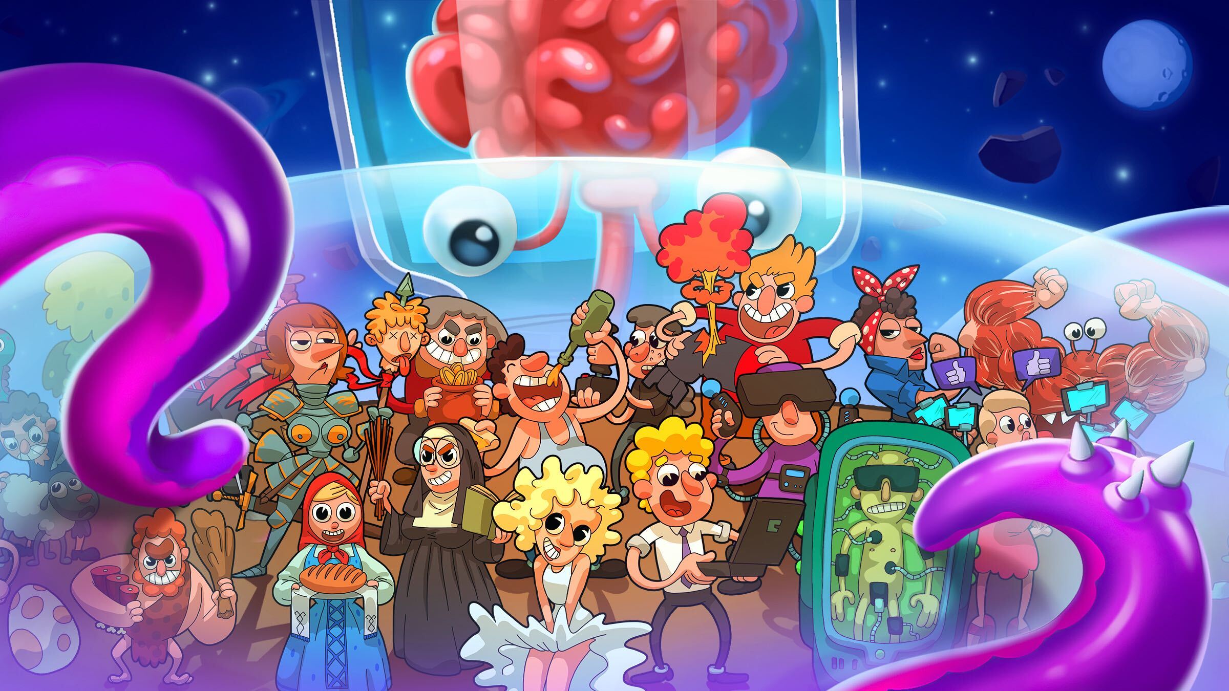
Brief history of the Evolution clicker game series development
With midcore games being our primary focus a few years back, we were only starting to look in the direction of the hyper-casual genre. At the same time, merge clickers were becoming very popular on the market, which inspired us to experiment in a new niche.
We decided to start with one project, but more and more new theories started to appear as the development progressed, and it grew into the Evolution game series with 45 million installs.
First project. Tap Tap Monsters Evolution — trying a new genre
This was an experimental game. We had no experience developing projects in this genre, so we focused on a wide audience. We settled on a setting with cartoon-style monsters with funny faces — it worked well together.
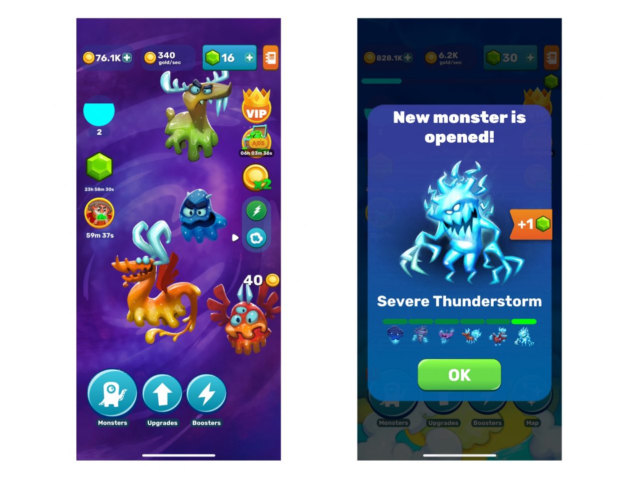
The prototype was ready in a couple of weeks. The mechanics are quite simple: monsters appear in the playing area, and players need to tap or swipe on them to get to new grades.
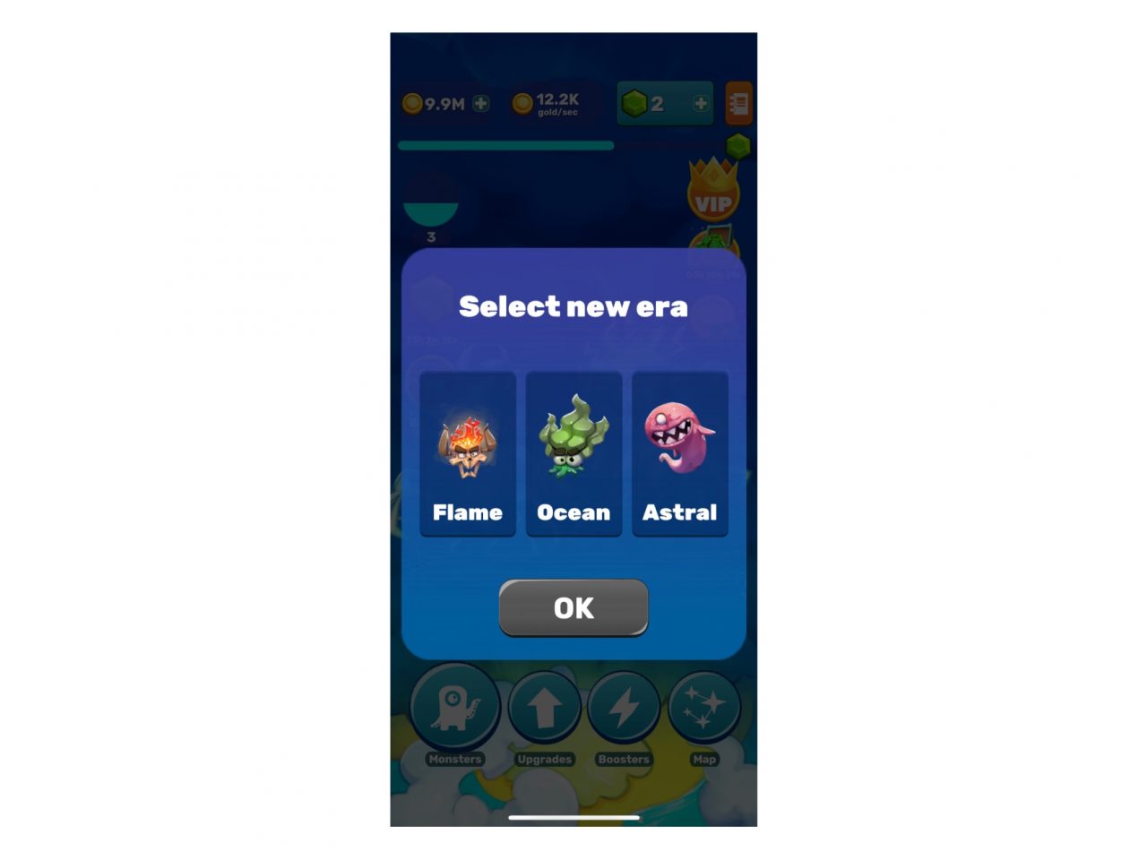
When it comes to the gameplay, we decided to stand out from the competitors by the fact that monsters are not divided by evolution eras from the past to the future, but by species or elements. For example, the first world consists of jellyfish monsters, the second — of electric ones, and after that players can choose a new branch themselves.
User acquisition for the project was going quite well. At their peak, the metrics were as follows:
- Android: R1 38%, R7 11%
- iOS: R1 52%, R7 16,5%
One of the genre’s unique features is that various types of monetization can easily coexist within it. We added in-game currency and in-app purchases to disable ads, a subscription with various bonuses, but the main monetization method was ads.
Tap Tap Monsters Evolution generally lived up to our expectations. Yes, the project didn’t become a hit, but it paid off and was in the black. The gameplay worked as it should, but we had some questions regarding the setting — after all, it’s quite peculiar.
Therefore, we decided to test this hypothesis and make a second project.
Second game. Homo Evolution — changing the setting
The setting of Tap Tap Monsters Evolution didn’t provide the player with familiar imagery, which could make engagement less effective. We decided to keep the cartoonish style, but remove the monsters and replace them with people.
Homo Evolution was made on the first game’s technical basis. We partially kept the artwork, materials and UI, as well as the sounds, but changed the background music. This project was aimed at the same target audience, but we expected it to attract more players due to the new setting.
Since the main goal was to test a different setting, the projects were basically the same gameplay-wise. Moreover, we implemented many features simultaneously to both projects. For example, a mini-game that starts at a random moment — in it, the player needs to tap the screen as quickly as possible to get coins.
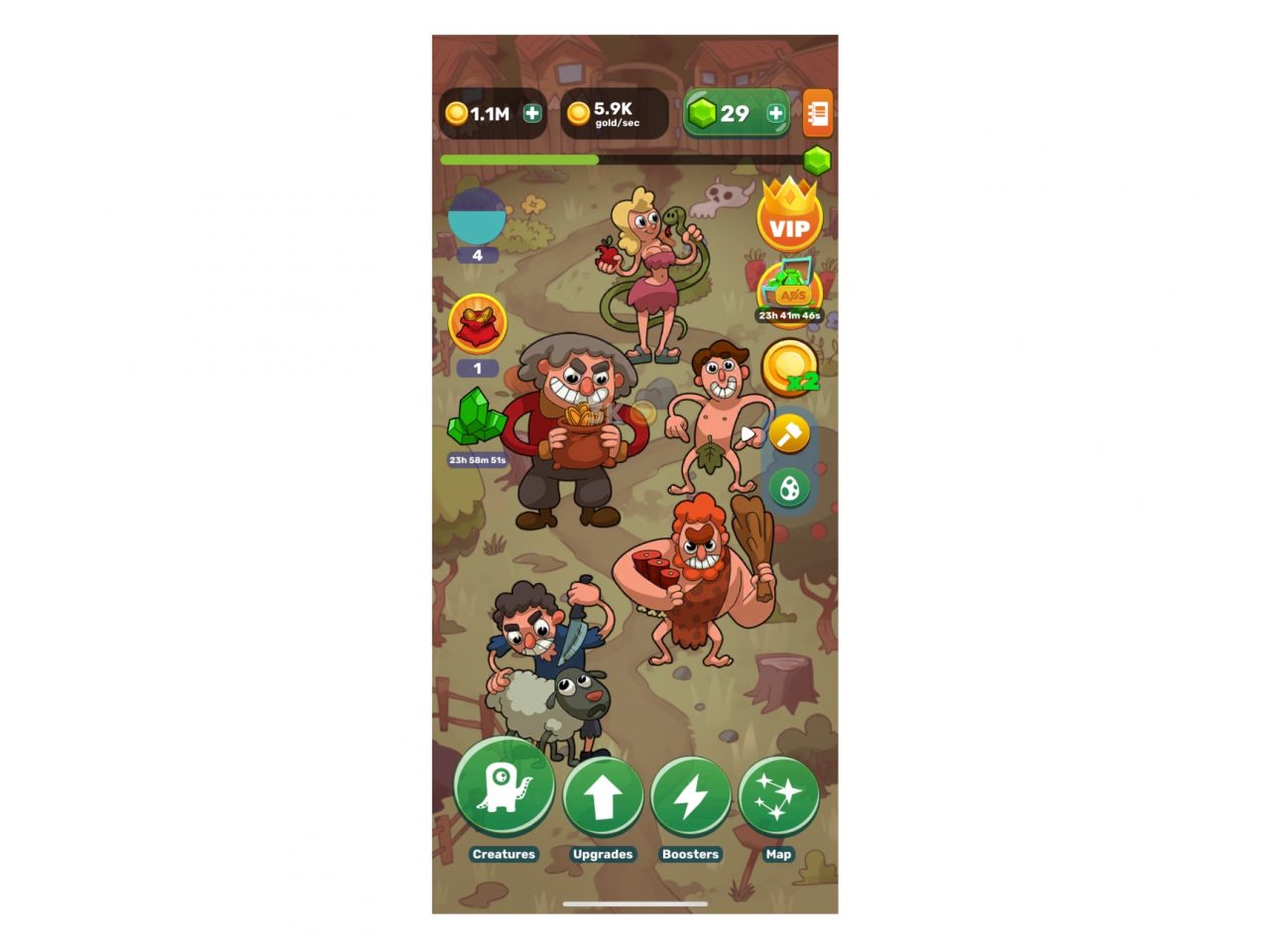
There already were a few projects about human evolution on the market, so we decided to take a different path and focus on the comedic elements instead of classic chronological storytelling. With any progression branch players might choose, characters evolve only up to a certain point — after that, they only change visually, taking exaggerated forms.
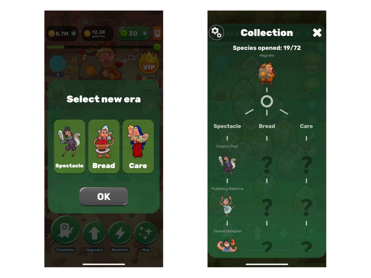
Players could opt for the fine arts theme with ballerinas and artists; or the Internet, where characters would have controllers and smartphones; propaganda; gluttony, and many other branches. In part, Tap Tap Monsters Evolution with its separation by elements already had it, but now the player could see the images they’re used to in real life.
This concept allowed us to add more humor and joke about trends, sometimes even risky, because extra hype can provoke players to leave negative reviews in the stores.
As a result, Homo Evolution immediately outperformed the previous project in terms of metrics:
- Android: R1 42%, R7 13%, R30 2%
- iOS: R1 62%, R7 25%, R30 7%
Together with the retention, the total ad revenue also increased. Initially, we completely transferred the monetization model from Tap Tap Monsters Evolution, but after the first tests, we added new points for interstitial ads (but with coins as a reward) and rewarded ads (with chest animation similar to CS:GO).
A mini-game with free spins was implemented, and along with it came another point for rewarded ads and a new in-app offer. The feature increased retention, as the meta became more diverse — tapping on characters for coins is still more boring than a full-fledged mini-game, which also helped the players progress in the main gameplay.
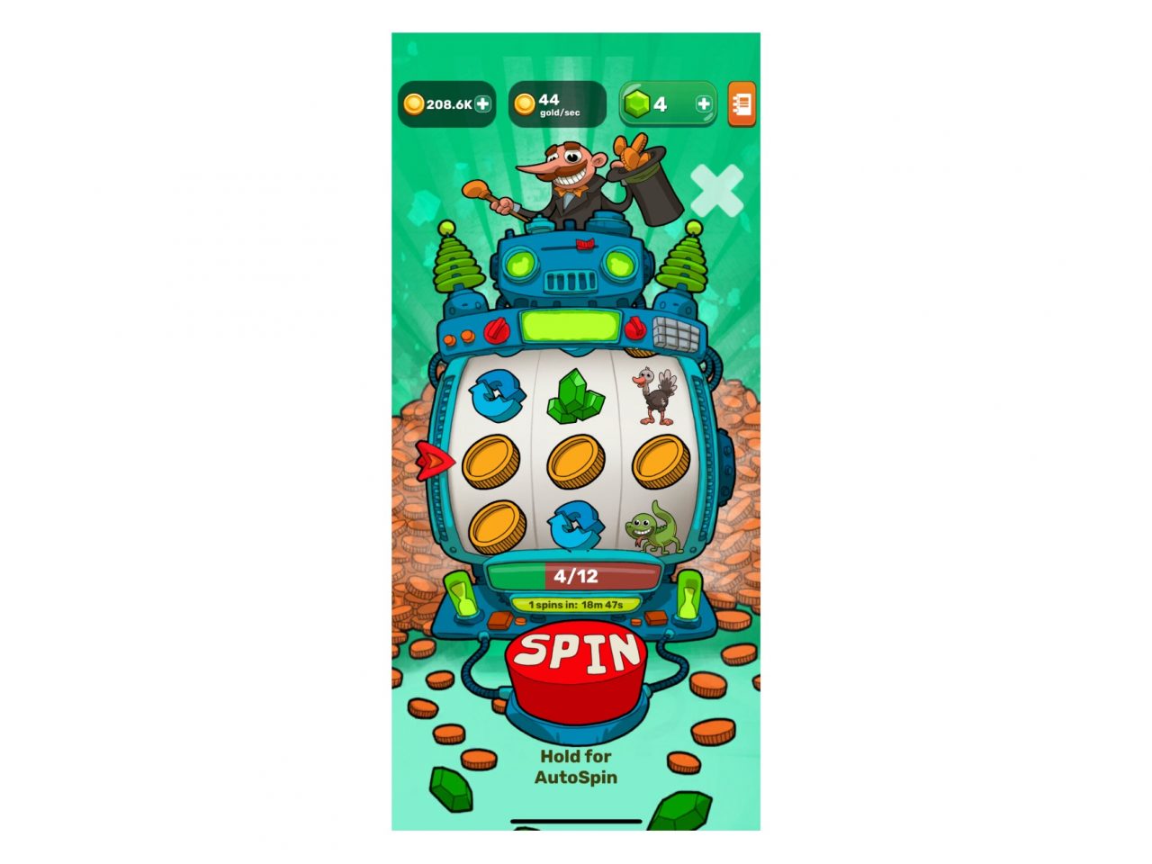
Rewarded spins
Both games were profitable and actively attracted players through marketing, so we decided to continue experimenting. A theory has emerged that metrics can also be affected by visual effects.
Third game. Big Bang Evolution — focusing on effects
We took the best from previous games in terms of mechanics, UI, meta, evolution branches, and updated the setting with an emphasis on visuals and sounds. That’s why we chose to go with bombs, although the target audience has become male-dominated.
The main feature is that each subsequent bomb explosion is more spectacular than the previous one. The selected evolution branch also affects the visual.
We paid special attention to the sounds. In previous projects, the background music was the only difference, but we’ve updated all the sounds in this one. Now each new type of bomb has a louder and more powerful explosion.
The game performed on par with Tap Tap Monsters, but couldn’t beat the Homo numbers:
- Android: R1 36%, R7 9%, R30 1.5%
- iOS: R1 43%, R7 15%, R30 2.5%
We could stop at that and call it a day, but one more interesting theory had to be tested.
In Tap Tap Monsters, Homo and Big Bang, the players choose which evolution branch to follow themselves (the only thing that changes are character visuals). When they reach the last grade, the planet will be completed, and the game will prompt the players to choose another one and start over. At this point, some users left the game — we assumed that they didn’t like being asked to start over. We decided to test this hypothesis and make a classic clicker with a direct progression and new visuals.
Fourth game. Zoopolis: Animal Evolution — making a classic clicker game
The biggest external difference is the new visual style. Now we wanted to focus on the female and family audience, so we went with real-life animals and chose a cute style. It seemed that this kind of setting would be well suited for playing with children, although the game still ended up being a bit too difficult for them.
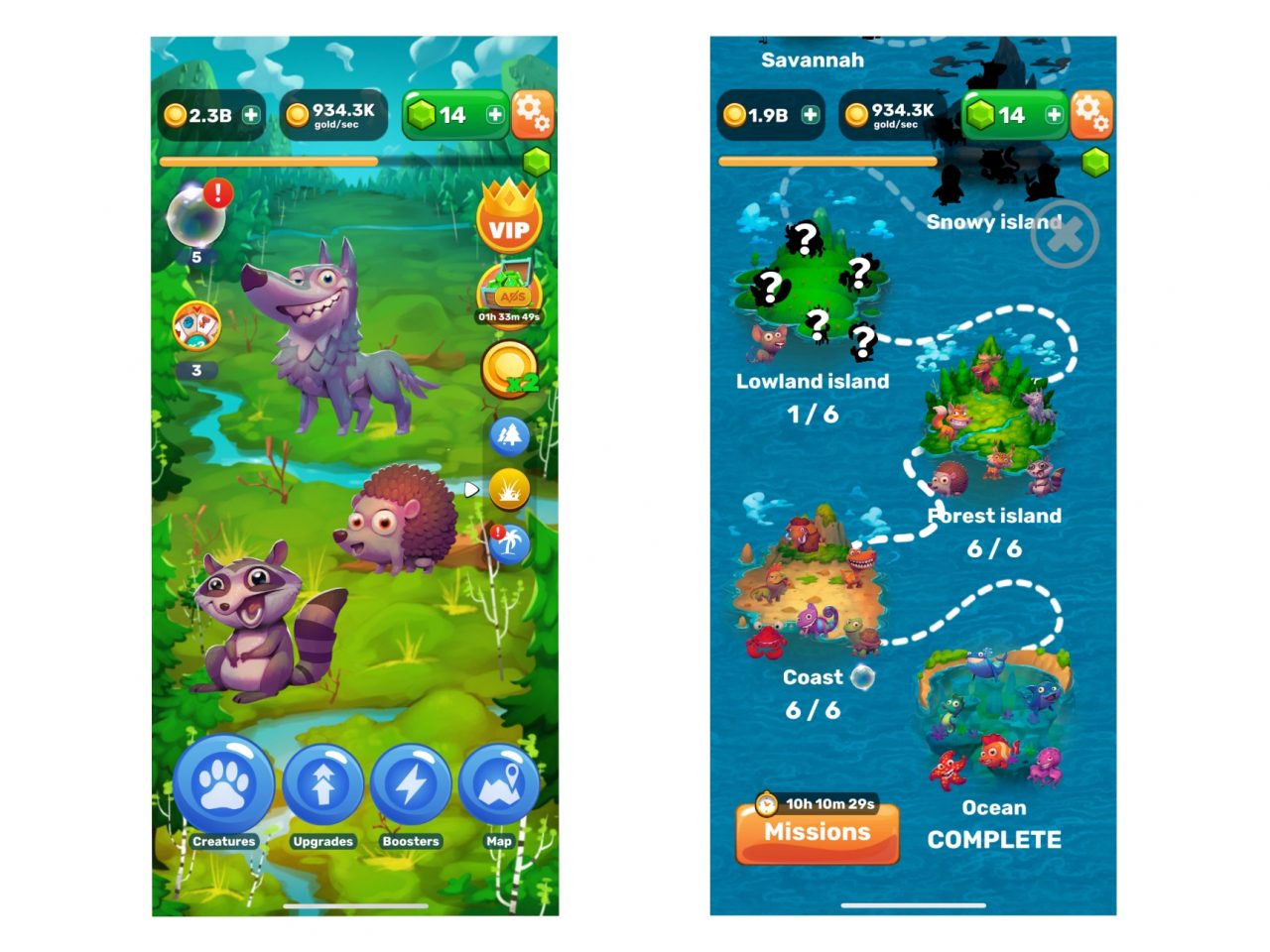
We completely let go of the different evolution branches in favor of the classics and made the progress direct. The player moves linearly across the world map with islands, collects animals, and unlocks new ones.
For the new progression system, we had to rebalance the economy and update the upgrade system — it’s predominantly a matter of math and numbers. In previous games, the initial character could be upgraded to grade 5 (in the case of Tap Tap Monsters, a level 5 monster appeared from the bubble right away) — we removed the restriction for this one. In addition, upgrade unlock has become dependent on a timer that can be skipped by spending gems or watching an ad clip. Later this feature was transferred to Homo and Big Bang.
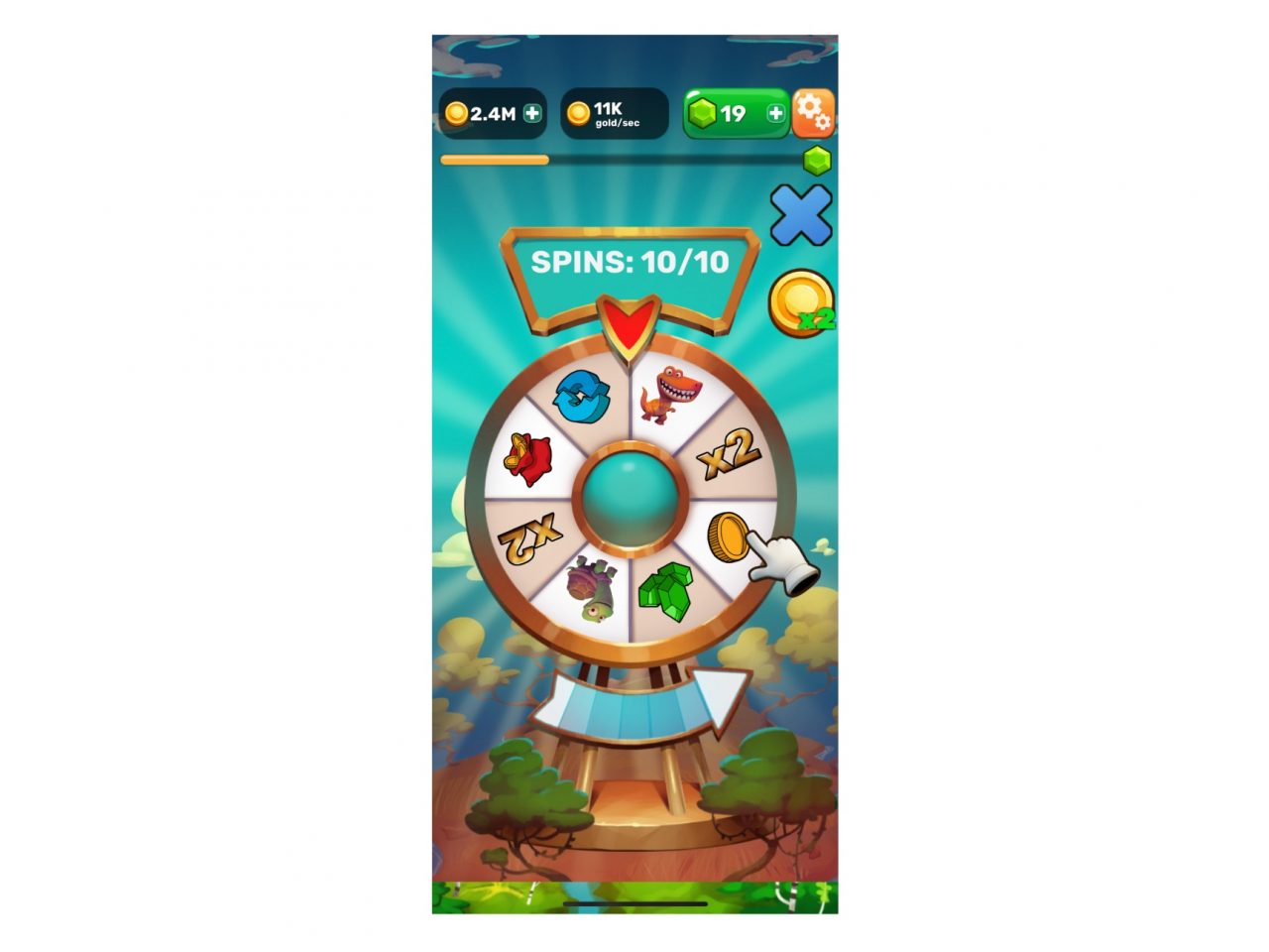
With monetization, no major changes were made. We experimented with interstitial ad display points again and, little by little, replaced the spin machine with a wheel of fortune.
As a result, the retention issue disappeared — our theory paid off. However, the project still fell in line with Big Bang, meaning that it didn’t reach the Homo Evolution numbers:
- Android: R1 40%, R7 13%, R30 3,7%
- iOS: R1 47%, R7 11,3%, R30 3,2%
We later tried to launch Zoopolis in China, albeit not very successfully. This style was popular among the local clickers a few years ago, and now more elaborate art styles took its place. To interest the audience, you need to really get into the nitty-gritty with the visuals, making them on par with casual games at the very least.
Money talk and conclusions
For the entire time of its existence, the Evolution series has earned about $2 million, and
Homo Evolution still remains the most successful project of the series.
We can draw a few conclusions from this whole thing:
- setting — recognizable images make players more engaged;
- humor — stems from the setting. It made coming up with ad creatives easier for the marketing team;
- mini-games — they have a positive effect on engagement, monetization and expand the meta;
- linear progress — prevents the players from leaving like they would if the gameplay started branching, but doesn’t have a key impact on the project’s success.
