How a PC strategy inspired us to develop State Connect, a mobile hypercasual game that generated more than $1 mln revenue for several months in a row
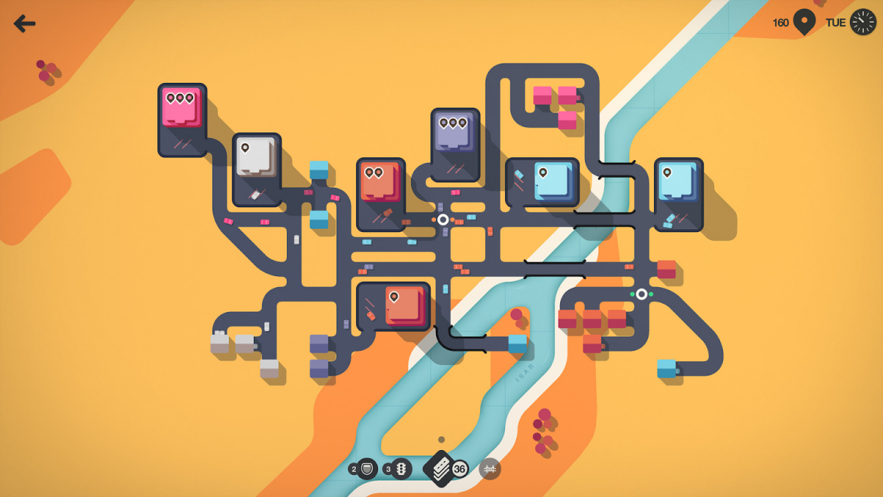
One day I was browsing Steam, and a calming game about building road networks between buildings in a growing city just grabbed my attention. As a matter of fact, I found out that it was first released for Apple Arcade much later. I initially saw it on PC. Its gameplay and amazing minimalistic visuals hooked me so much that I suggested one of our partner development studios, Twin Crab, convert this game to mobile devices.
The main problem was that the original PC mechanics were too complicated for hypercasual games, so we had to do some iterations. Despite the first hypotheses, not all of them were successful. The game also showed a record share of in-app monetization for hypercasual games.
I’ll tell you everything in order: about the origin of the idea, the transfer of visuals, metrics, monetization, and how important it is for developers to think beyond and look at the game from the player’s side.
Origins of the idea
There’s no point to hide that I was inspired by the Mini Motorways. The project is great and has “Overwhelmingly Positive” reviews on Steam. It’s a kind of time management game about optimizing travel between shopping malls and residential buildings by building new roads and interchanges.
First, the gameplay really got me — a peaceful, calm environment that also presses you with limited time and where you need to constantly do something. This concept fits perfectly into hypercasual games since meditation experience and challenge features are very important there.
The second thing I noticed is the very juicy, minimalistic visuals. All the important elements are highlighted in bright colors, everything else is pale.

Many developers try to burst into the hypercasual games market through visuals, but the game also had exciting gameplay. Anyway, it still had to be adapted.
I came up with this idea to the guys from Twin Crab — they enthusiastically picked it up, and then we discussed everything together. Moreover, we’ve been working together for a while.
Nikolay Grishachev, co-founder and developer at Twin Crab: “When we founded our own studio, we immediately went to the publisher because we simply didn’t have enough budgets for large-scale advertising campaigns. We chose mainly based on reviews and so came to Azur Games. First, we came to the tests with our puzzle, and the metrics were borderline. Then we made several iterations, but they didn’t bring any results. It became clear that we needed to take on new projects.”
Mikhail Chernavsky, co-founder and developer at Twin Crab: “We made a few more prototypes, but it didn’t work out with puzzles. We tried other genres, and then Yuriy Tsoi, product manager at Azur Games, sent us a document with the idea of State Connect, and we started thinking about how to make it a reality.”
Gameplay and beginning of development
The first task was to simplify the gameplay. This is where other Azur Games projects came to our aid — State.io, inspired by a real map of elections by region, and FlyCorp, inspired by Flightradar24 with real-time airplanes. From these projects, we took the core mechanics — stretching the way from one point to another with a simple swipe on the screen, as well as nice visuals.
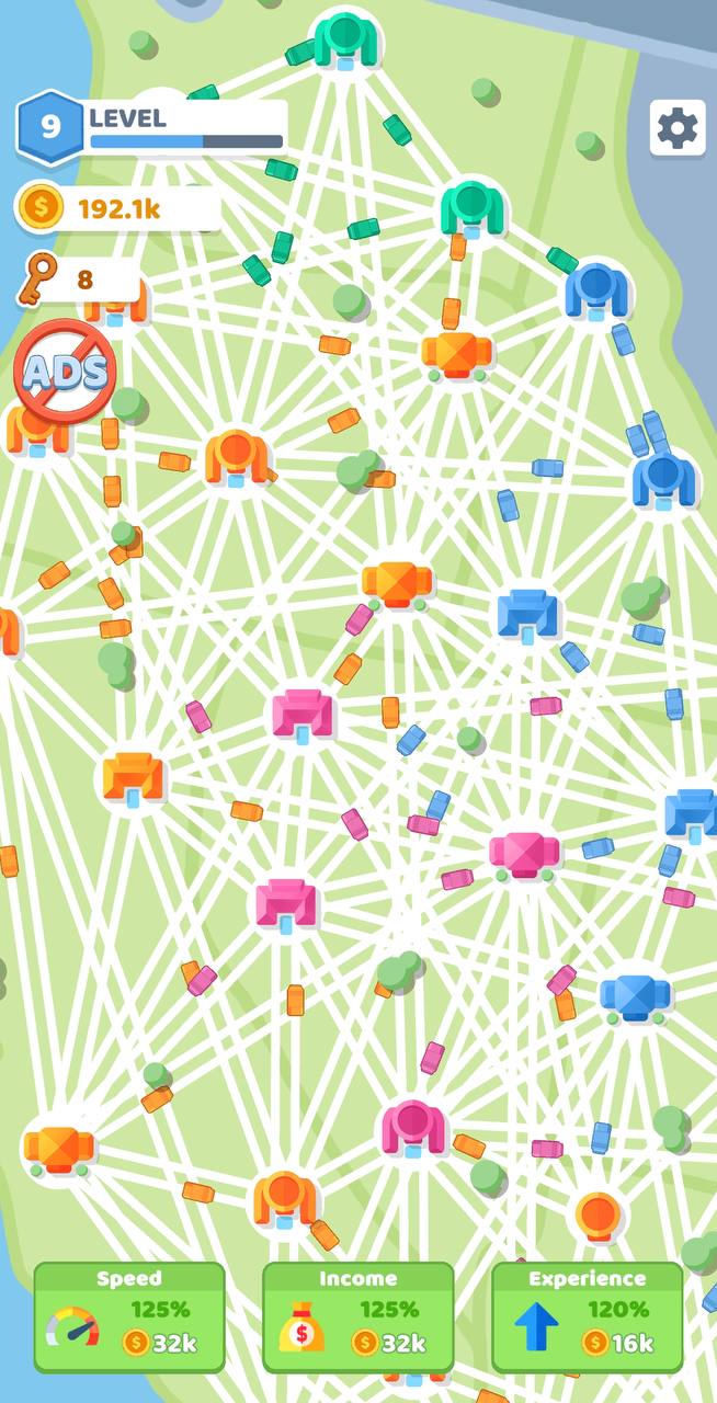
Next, we began to shape it into a general picture. Well, we have a map of a country, state or region, there are cities that we should connect one after another, and also there are cars that start driving along these roads. So we get a kind of transportation system.
We approved this concept with the Twin Crab team, they paid special attention to the importance of visual style, and development began.
The first prototype took a month, which is quite a lot for a hypercasual game. It took some time to write the behavior of cars between points. The player only routes the way, then the cars should drive themselves without any bugs and lags, so the prototype needed polishing.
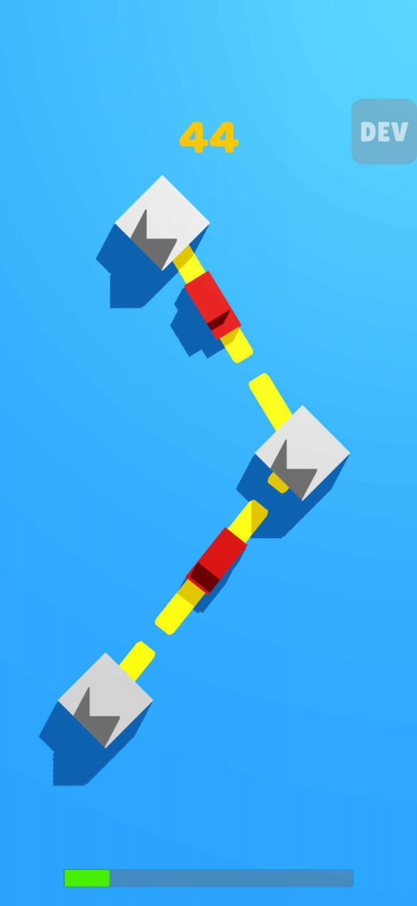
But this was not the main problem — the very first prototype was ready without visuals. It just looked like squares riding between other squares, and we wanted to focus on the catchy picture so we could start testing right away.

I was almost upset at first, but when I played it, I realized this was exactly what we needed. Core mechanics, controls — everything was fine, we only needed to cover our build in a beautiful wrapper. Once it was ready in a week and a half (Android only at first), the first test showed the following metrics in the US:
- CPI: $0.3 (worldwide — only $0.03)
- R1: 35–36%
- Playtime: ~18 min
Retention was average, but CPI got our attention — that was already when Facebook raised ad prices, and at that time it showed good results. And the best part was playtime — 18 minutes, which is very good for hypercasual games.
Such metrics were more than enough to work further.
Game polishing and global launch
By this stage, upgrades of buildings (to increase the number of cars and the profit they bring for delivery) and the opening of new states were ready.
Danila Konchaev, product manager at Twin Crab: “Since playtime was very high, we were afraid that users would play through the game very quickly — there wasn’t enough content yet. That’s why immediately after the test we started rebuilding the balance to make the player’s progression a little slower.”
Then we proceeded to monetization, namely interstitials. Since there was only the US map at the game start, we decided to show interstitial ads every time the player opened a new state. The ads brought good results, and the game paid off.
Then we added upgrade buttons at the bottom of the screen. For in-game currency, players could upgrade three parameters: the speed of cars, the speed of gaining experience (to open neighboring states), and the speed of earning in-game currency. We tied rewards to these buttons — for watching ads, players could upgrade one of the parameters from time to time. This immediately increased LTV and didn’t affect retention in any way.
But the game still had very little content. When the player opened all the states, they had no choice but to stare at the hive of unlocked cities and cars riding between them.
The quickest solution was adding the Reset button so the player could start over. This increased replayability, and more players began to stay in the game.
After that, we started planning user acquisition and global launch. We wanted to see what the game would be like with increased traffic.
Danila Konchaev: “We also prepared the iOS build, and it performed even better than Android. For example, R1 was about 50%, the game slightly made it to the top, and there was a lot more organic traffic.”
The project performed great right away, which allowed us to make large spends per day up to $20,000 after two weeks of purchase. If the game allows you to make big spends, it’s always good because it’s an investment for a long time and will return in profit in the long months. In January, February and March, the game brought in more than $1 million revenue each month. Now the game makes money, and soon it should perform really well.
Both metrics and ad spends at the start made us very happy ’cause there was still very little content — players cleared the game in 3–4 hours, and then they could just start over.
As for the visuals, they were virtually unchanged from the very beginning. We used vibrant and bright colors for important elements like houses, trucks, upgrade buttons, buttons designed for opening new states, and more quiet colors for everything else, e.g trees, grass, and undiscovered locations.
Maria Demina, Twin Crab artist: “We tested different houses on creatives, tried pseudo 3D instead of a flat design, colors. In the end, we left the ones that performed best and haven’t changed them since.”
Monetization boost
A very good boost in revenue came when we stopped showing interstitials only after the new state opened and set a 50-second cooldown. Ads were shown no matter what happened in the game. This almost didn’t affect either the rating or retention (it dropped by 1–2%) but gave a large increase in LTV. It became clear that if players like the game so much, the number of ads won’t scare them away.
Then we added an in-app that disables ads. It wasn’t expensive – something around $4, but we didn’t expect anyone to purchase this option.
Suddenly, requests to disable ads just started pouring in. I’ve seen the games with interstitial ads appearing every 20 seconds before, but even there players didn’t purchase the No Ads option, but they did it in our game. It brought in $5,000 to $10,000 a day. At some point, in-app purchases brought in almost 20% of the game’s total revenue.
We attribute this to several factors.
- First, the audience has become ready to spend money on games, perhaps it’s a unique trait of the generation that grew up on them.
- Second, we have a slow, really peaceful and calming game. Usually, hypercasual games are much faster in terms of gameplay — you always should run somewhere, something’s always happening on the screen. Our players relax, and ads disturb them — the ads are usually bright and suddenly flash in the game, so users want to disable them.
- Third, the game gives an impression of scale (and is really constantly growing), which could further motivate players to disable ads since they were going to stay in the game for a long time.
Failed iterations
When you work on a project for a long time, you stop seeing it as a game. But sometimes it’s important to take your mind off it and look at it from a different angle. For example, we really believed in limiting the number of roads. We’ve thought that if build up everything with roads, that is connect the cities with as many roads as possible, it turns out to be chaos.

Our hypothesis was to limit the possible number of roads from the city (no more than three), remove the visual chaos, and keep the player for a while as they would have to wait longer for resources’ delivery. But the test showed poor results in all respects – in ads, retention, and so on.
It turned out that players like to build up everything with roads, creating as many ways as possible. In addition, many players believed that the more roads, the more earnings, but that’s not really true. Each city has only a certain number of cars. But we’re thinking about testing the growth rate of the in-game currency from additional roads.
*****
The biggest failure was when we tried to add new content, namely the European continent. Moreover, the players asked for it in reviews. As a result, we made it so that the user could select a continent on the global map before starting the game.
This also reflected badly on advertising, retention, and other metrics. We expected to increase the long-term retention but ended up with bad results for the first days’ retention even.
Nikolay Grishachev added: “In the next test, we simply removed Europe completely, but the metrics were still dropping. And players kept asking to return Europe back in reviews.”
We failed to determine the cause of the drop in metrics, so we decided to limit ourselves to North America — the US, Canada, Alaska (we singled it out separately), and Mexico. This update has already performed better than Europe. But despite our first failure, we’re planning to test and add new continents.
*****
Mikhail Chernavsky: “We also tried to weaken the balance to make it more dynamic. More fun, as we thought, but the players reacted badly. It turned out that even though the game is hypercasual, the players still need some kind of challenge.”
What’s next
The list is quite long. First, we’re planning to work on new continents to add more content and increase the first days’ retention.
Nikolay Grishachev: “Players often ask us in reviews to add removal and upgrade of roads, so when we add new content, we’ll test such an extension of the mechanics as well. We’ll also work on meta: daily quests and other features that directly affect the metrics.”
Maria Demina: “We want to experiment with weather conditions and seasonal changes to somehow diversify the visuals, but we’ll do it a bit later.”
We also thought that the player shouldn’t just watch the cars but interact with the game, so we want to add in-game events. These can be pop-ups with relevant events, for example, the situation in the cargo transportation market and rewards.
What is more, now we’re working with the studio on a new project. It has a similar genre, but we apply here new mechanics and all the expertise accumulated by our team. We also plan to add more challenges and time management elements, but now it takes much time on fine-tuning State Connect to reach the maximum income so the studio could safely develop new projects.
