ASO tests roundup: Volume 2
As we discussed in the first part, even the smallest tweaks to icons can yield significant improvements in metrics, sometimes in the double digits. But we don’t stop there. Our team is constantly reimagining and redesigning visuals, and in one case, we’ve seen a whopping 100% boost in organic installs as a result.
Today, we’re delving further into how various adjustments can impact ASO performance in our department. We have a dedicated Slack channel where team members share their before-and-after versions along with comments, highlighting some of the most interesting cases we’ll be discussing further on.
Kingdom Clash
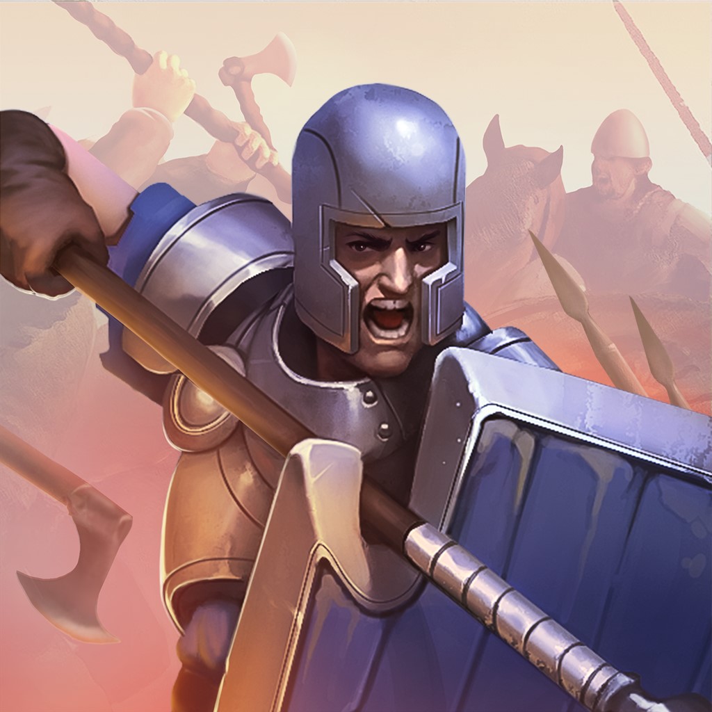
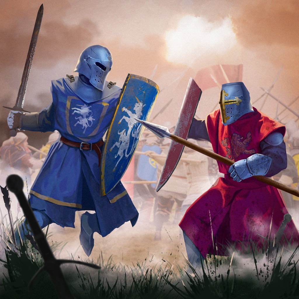
The icon featuring two knights in blue and red battling it out resulted in a substantial 44% increase in installs worldwide and across all locales.
This boost can be attributed to the icon’s ability to effectively communicate the gameplay’s unique features, while also capitalizing on the popular trend of showcasing battles between similar game units from different teams. It’s worth noting that many other developers have also started adopting this trend in their own icons.
Mommy Maze
The initial banner for the game lacked any characters and was in need of improvement.
After testing a version featuring Mommy and a girl, we saw an expected 10% boost in installs among a 10% audience sample. Although not bad, we knew we could do better.
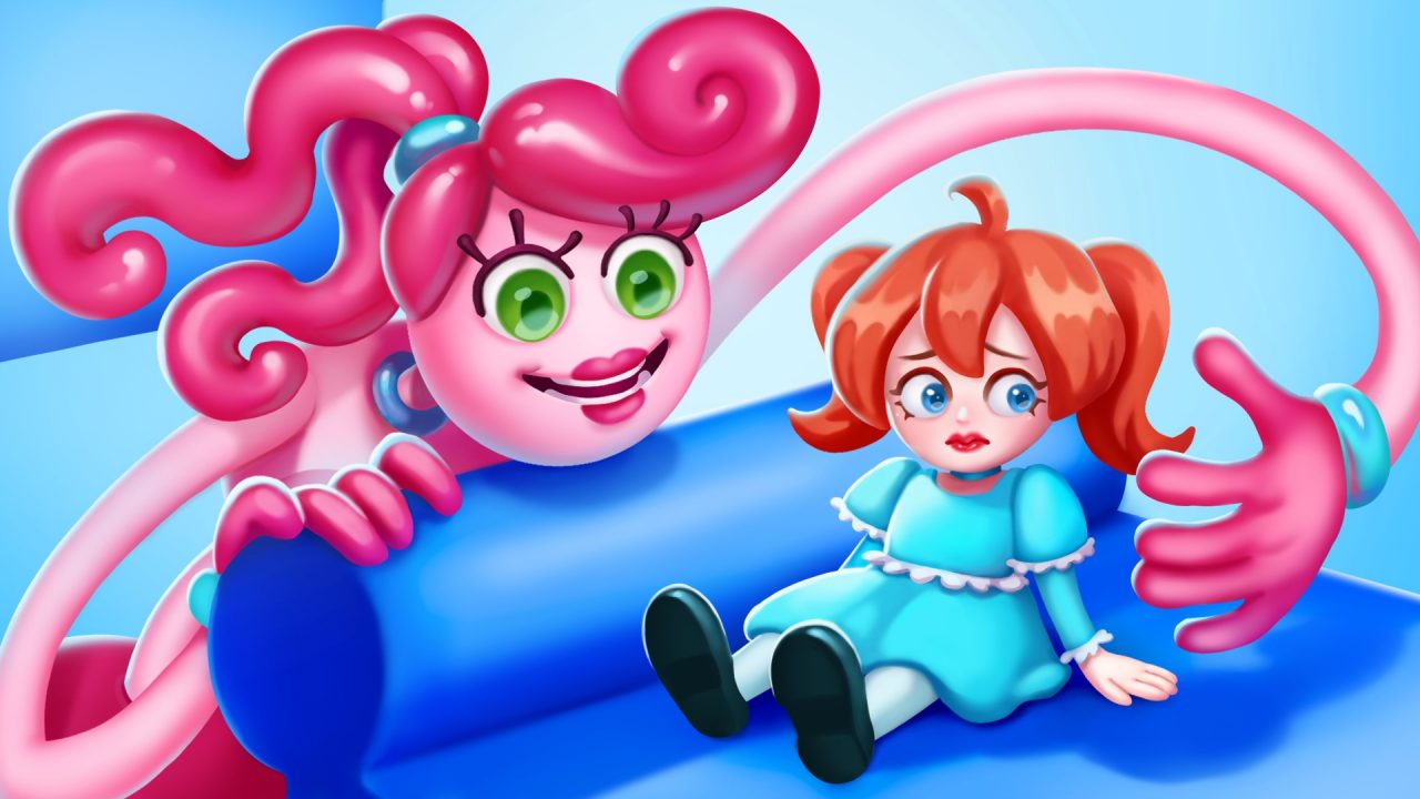
Our team experimented with the banner by featuring Killy Willy — since he looks more intimidating — against Mommy on it, with added movement and dynamics. However, the metrics showed no significant change, leaving us at a standstill.
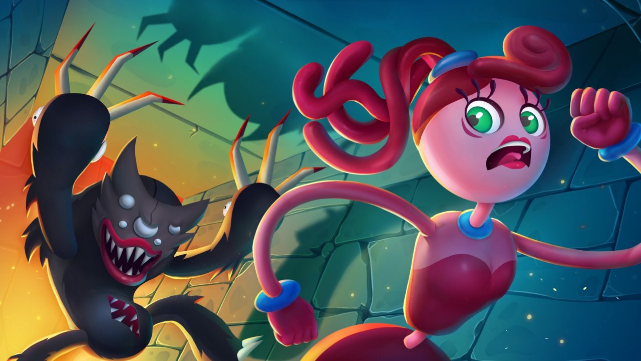
In the end, we changed the color palette to be closer to the initial version with the girl and saw a few more percentage points increase in both installs and retention.
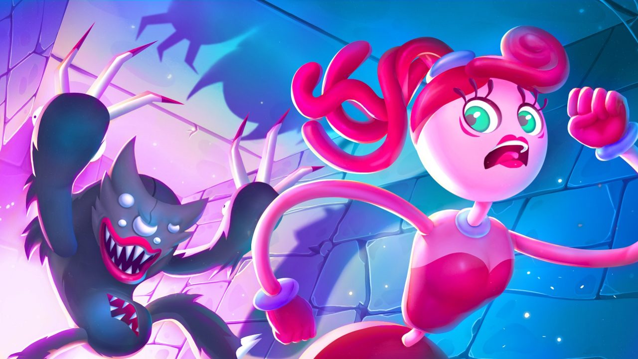
In other words, color can be just as influential as composition.
Merge Archers
After a series of iterations, a simple modification to the icon’s background yielded remarkable results.
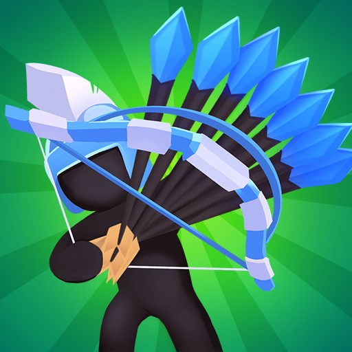
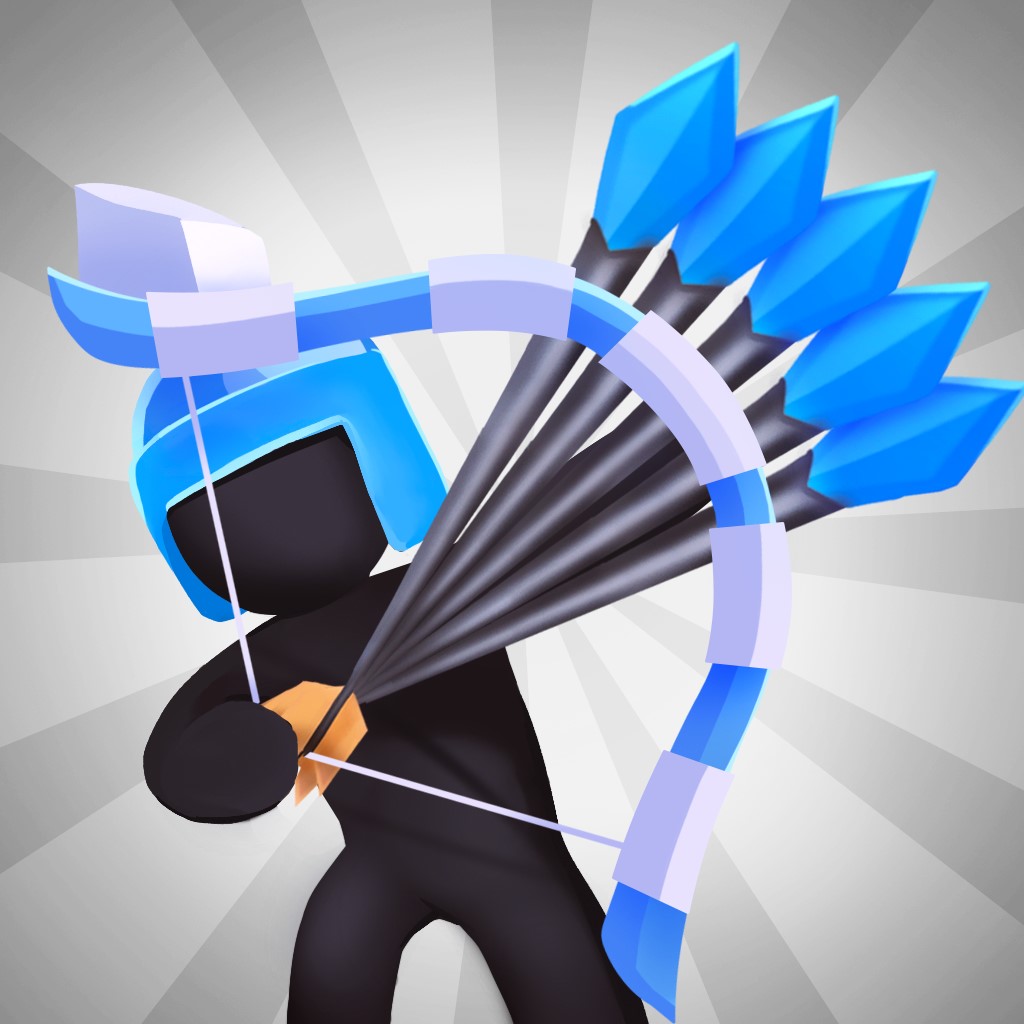
However, the journey to get to that point involved a lengthy exploration of numerous hypotheses, far more than what is depicted in the images.
Initially, we experimented with changing the background color of the first option to various vibrant shades, which occasionally provided a slight boost, but not enough to proceed. We also tried to keep the green background while changing the angle and pose of the character, both with and without a helmet, but all resulted in a negative impact on metrics.
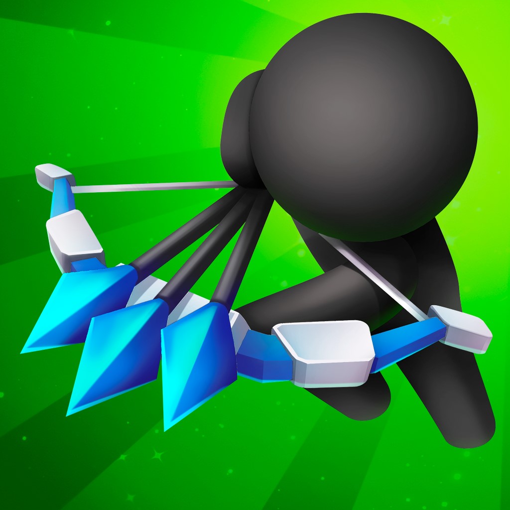

Eventually, we settled on the original version but added contrast to the character by making the background gray.
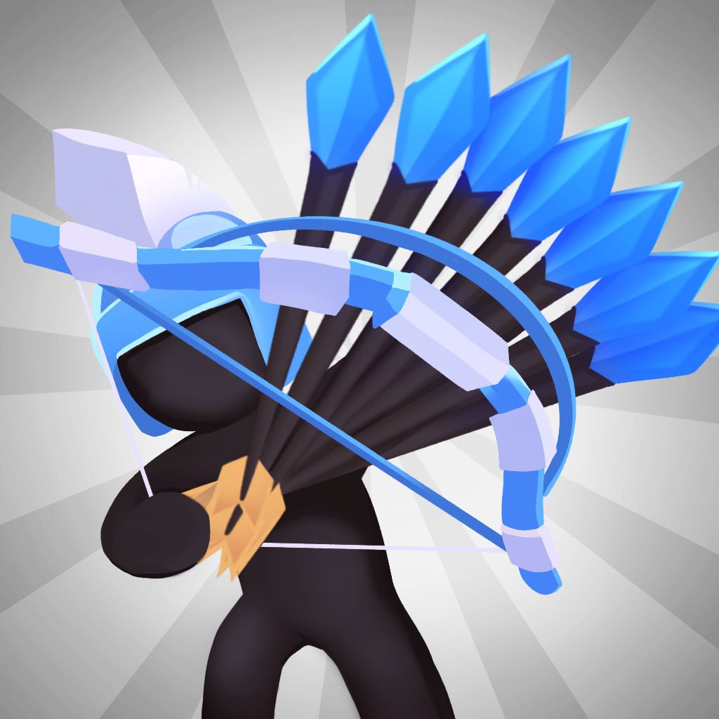

This caused metrics to increase by almost 3% in installs and retention. After that, we tried painting the arrowheads in different colors, but this modification didn’t receive positive feedback from users.
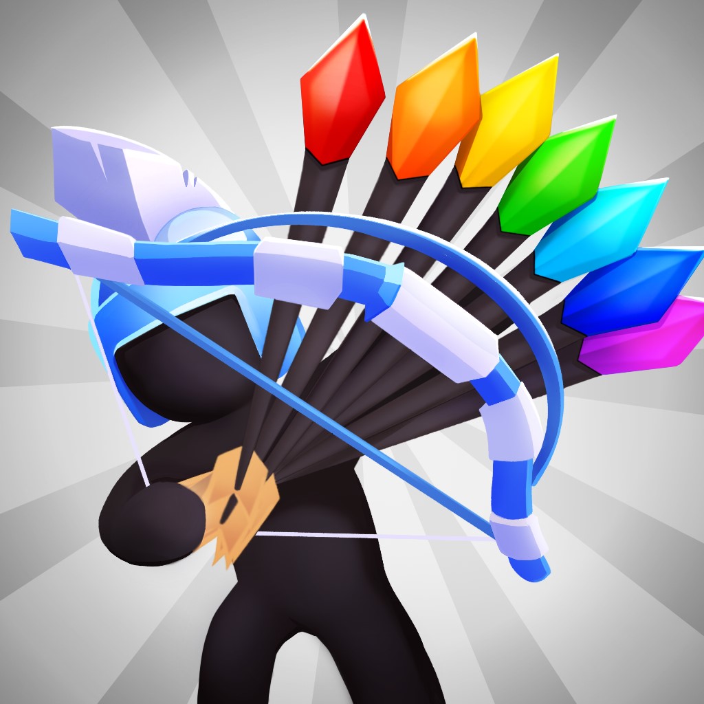

We went back to the drawing board and tried various adjustments, such as experimenting with the number of arrows and removing the helmets. The metrics started decreasing again, which told us that oversimplifying the visuals wasn’t the way to go either.
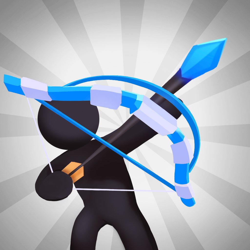

Finally, we arrived at a slightly modified version of the original icon with five arrows and a gray background, which yielded the best results in terms of metrics: we got an additional 2% in both installs and retention.


However, the gray color had mixed results in screenshots, prompting the team to halt the test. On the other hand, the videos with a new background applied were tested on the entire audience, resulting in a small improvement.
Modern Strike Online
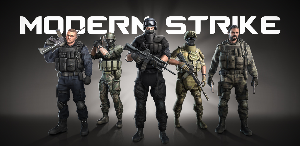

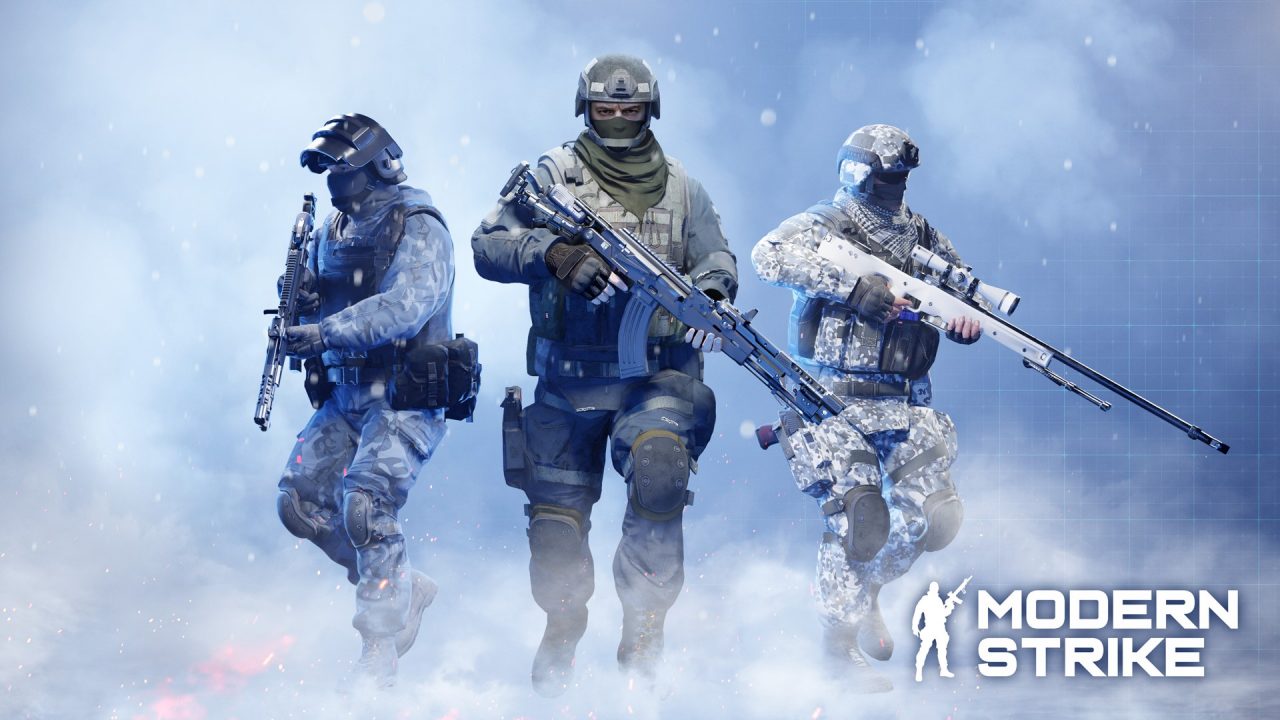

The latest banner composition proved to be a game-changer, after a long struggle to improve the previous one. This resulted in a 15% increase in new installations and retention for most locales and in Tier-1 countries.
Initially, we reduced the number of characters and added more details, movement, and dynamic poses. Additionally, we refined the monochrome background to give it a premium and elegant appearance.
Despite this, we continue to experiment with new poses and backgrounds, always looking for ways to elevate the game’s overall visual appeal. This game has been with Azur Games since the company’s inception, and we’re still testing new icons and banners. The lesson we’ve learned is that ASO is an ongoing process that requires continuous testing and optimization, rather than a one-time activity during the game’s launch.
User preferences and visual trends are constantly evolving, and staying on top of them can have a significant impact on your project’s metrics. The examples we discussed earlier highlight that even small changes in icons and banners can affect user engagement and retention rates. This is because when a user comes across a game page on the app store, they already have certain expectations in mind. If the actual game experience diverges too much from those expectations, then the user will quickly lose interest and move on to something else. This is why it’s important to prioritize user expectations over just install growth rates when working on ASO.
