Tests showed a projected 100% increase in conversion to installs caused by changing the app icon. What really happened?
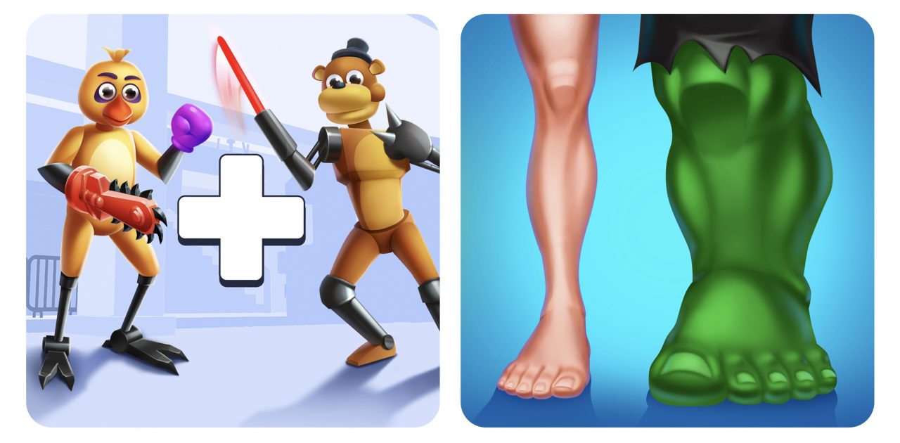
We decided to radically rework the icon for our game Merge Ragdoll Fighting and test the new version on a real audience. Here’s the two versions:
According to the A/B test, the version on the right showed a projected increase in the conversion rate from views to installs by almost 100%. This has never happened in the entire history of the Azur Games ASO team.
The case is unique, and we were eager to get to work and find some real answers:
- Will the boost really be this big when we replace the icon for all users?
- Which promotion channel is going to work best?
- And how will all of this affect the project’s audience?
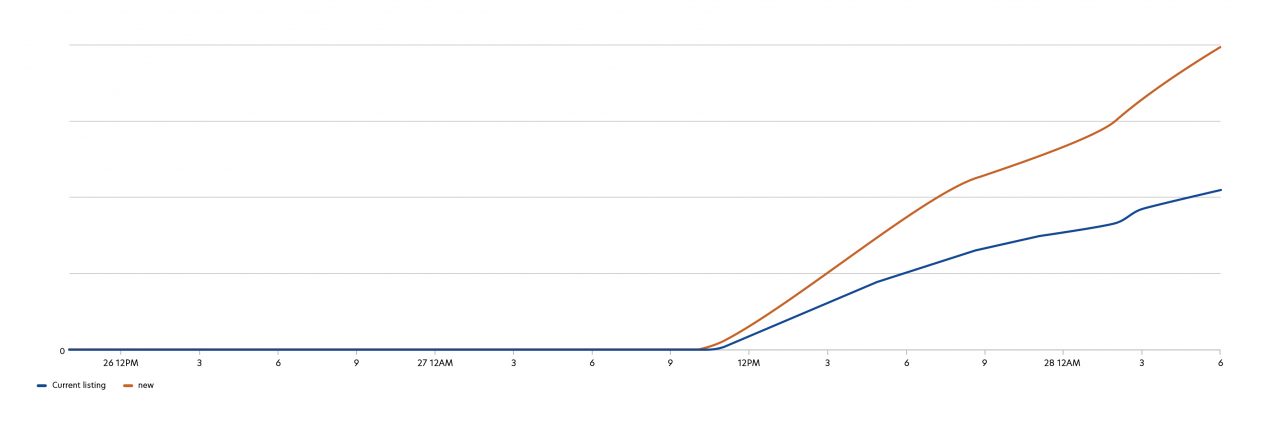
In real practice, the installs have indeed increased, and the process was interesting in more ways than one.
Progress so far
1. Promotion channels. The new icon performed best on Google Ads — at their peak, the installs kept growing after they surpassed the 100% mark and reached 200%. A little later, the organic traffic (green graph) entered the arena, doubled compared to the past and stayed at this level for a long time.
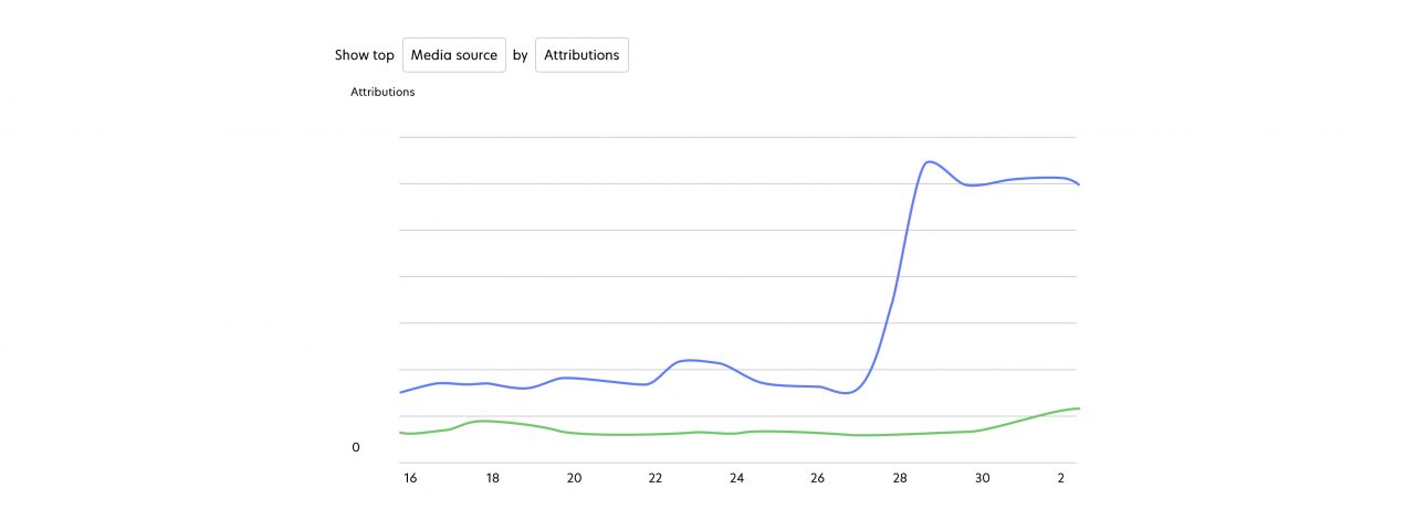
At the same time, traffic from other ad networks stayed intact, most likely because on other platforms, good ad creatives are way more important than icons. A user who comes to the store after watching a clip already has some expectations and doesn’t pay as much attention to the icon or text — that’s how it generally works.
In turn, when Google Ads show the users our ads for the first time in the store, they already come with an icon — this can be a text ad or a collection by genre.
2. Audience. Due to a sharp increase in exposure, the project started to attract a non-target audience. We even had to optimize UA to prevent the budget from taking a hit.
3. Organics. Although it has doubled in size, the expectations were much higher. We hoped that after a surge in player interest, the store’s “algorithms” would pick up the project and start showing it even more in various collections and the Recommended section on the pages of other games. It never happened.
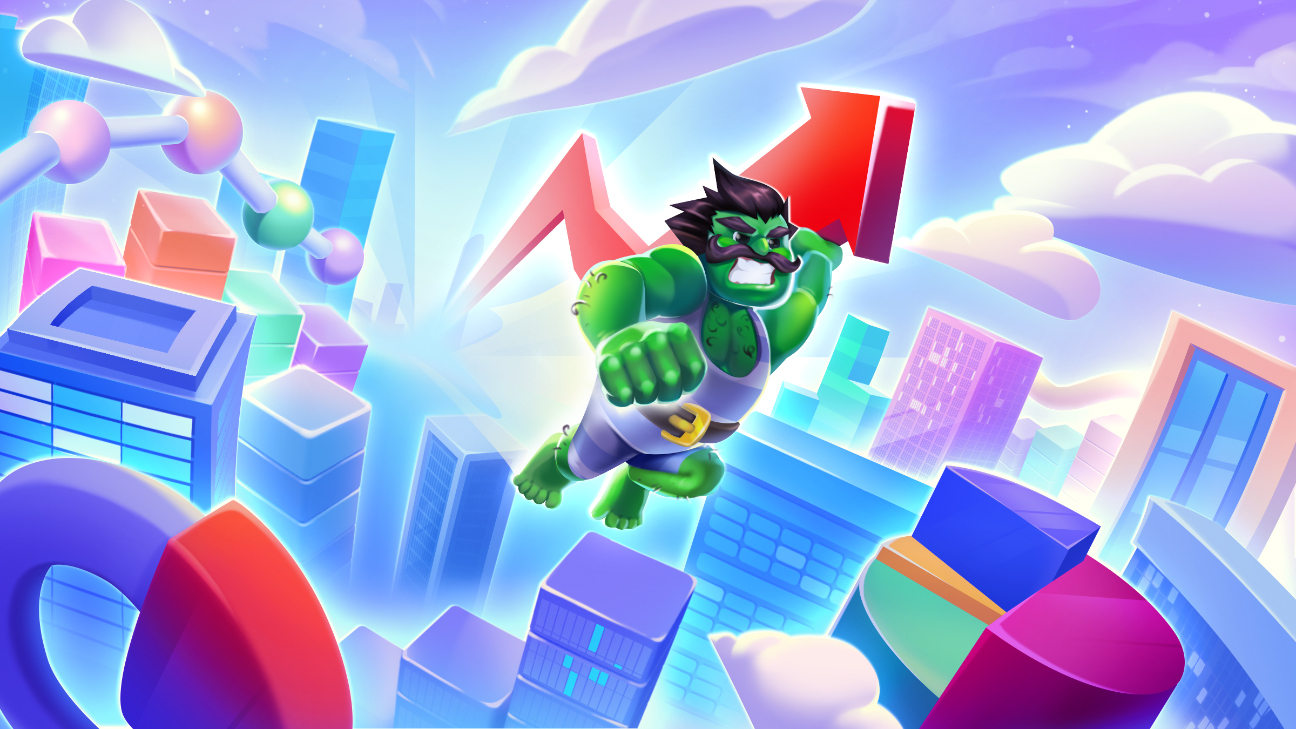
4. Key search requests. The conversion rate from collections has grown a lot, but the conversion rate from key search requests has dropped. It could be that some people looked at the icon and expected to see a battle between a man and the Hulk or a superhero game. But the actual gameplay looks like this:
We can conclude that the icon is not tightly associated with the gameplay. In various collections, the image looks attractive to new players due to references to famous characters and icons for other popular games. However, when users search games by genre, the icon can lead them to think that the store’s algorithm shows the project of the wrong genre, as it often happens. The old icon, even though it showed the worst conversion to installs for all traffic channels in general, worked much better for key search results related to fighting games. For example, brand queries gave us 6% more clicks, because they reflected the real gameplay better.
Alexander Darchenkov, Azur Games ASO manager
Final thoughts
With any app, the icon is extremely important for Google Ads and can provoke an unexpected install boost for it. It’s safe to rely on tests and let them lead you to the best options. We’ve already posted some examples.
The current option is definitely here to stay, at least until we find a better one. Now we’ll try to understand what exactly made the players like it so much, and apply this experience to video creatives, screenshots, and so on.
You also need to remember that even a large number of installs won’t guarantee universal success if a non-target audience comes — you need to monitor it carefully if you want to effectively attract users and not drop too much when it comes to searching the project by main keywords.