How changing app icon affects conversion to installs
Our ASO department works on dozens of projects — both new and old — every month. We can test dozens of icons on a particular hit game in a year. In total, we’ve got hundreds and thousands of images that go through tests and analysis.
Icons are only a small part of the whole work you have to do for ASO (more on that here), but even they can have a strong impact on the game. And since we collect all the cases and analyze the results, I chose a few recent ones that seemed interesting to us. Let’s go.
Ragdoll Weapon Master
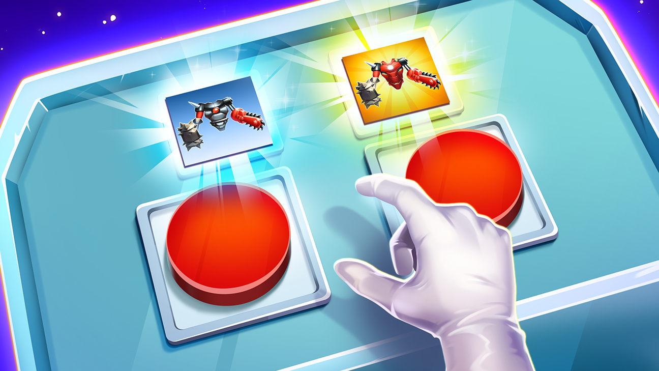
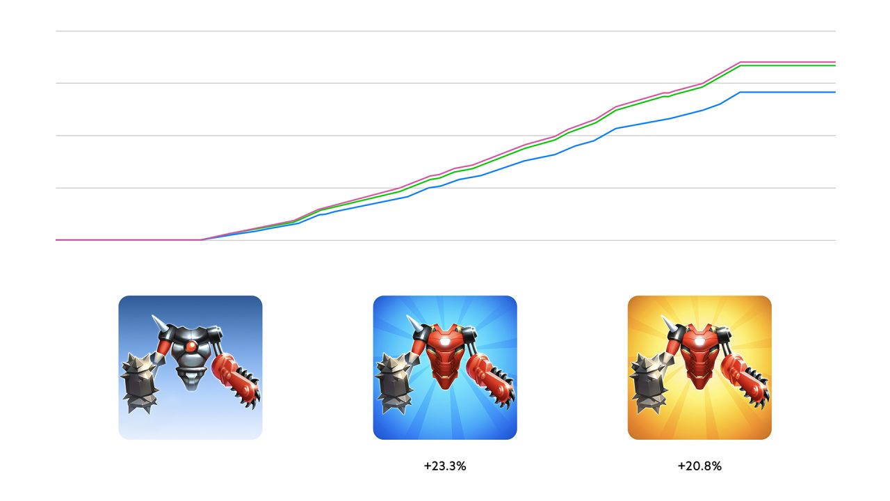
The red armor showed a very decent increase in the expected conversion to installs — 20-23% more compared to the blue armor. You might think that it’s only a matter of how vibrant the color is, but at the same time, red armor on a bright background performs a little worse than the same armor on a more low-key color. Most likely it’s not only the vibrancy, but also the contrast.
Tricky Castle
The icon with the key on it showed excellent results in every country, the estimated conversion is almost 10% higher than the first option. Like the previous case, the new art is also more vibrant, but it feels like the door and key simply convey the essence of the game better.
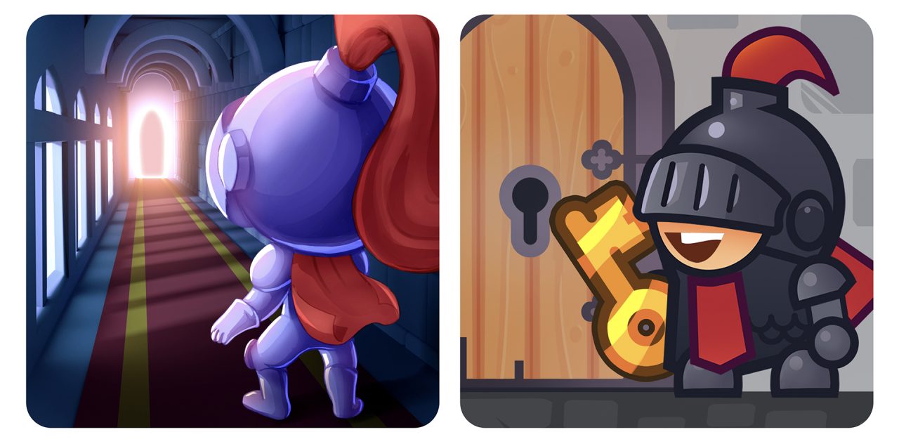
In some of the CIS countries, the estimated conversion increased by astonishing 39%, which is quite interesting.
For ASO, this means that you need to dive deeper into regional markets in order to understand what works and where. There are often interesting cases in particular countries like this next one.
Train Simulator
A banner with a swamp on it for store listing in Turkey showed good results. Estimated conversion increase reached 11.5%. To be honest, that was unexpected because it’s hard to say which string of the players’ the souls we managed to touch.

It’s unclear how the train style influenced the situation, because when we used a Turkish locomotive for the country test, the results were nowhere close. On the other hand, there’s a possibility that people are more attracted to vintage steam locomotives pumping smoke into the air.
STAR: Super Tricky Amazing Run
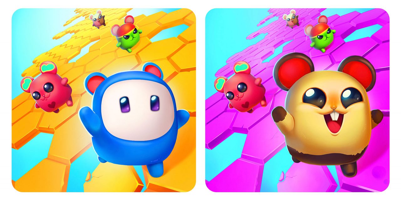
For this game, we tried to put a different spin on Fall Guys, which was trending at the time. We explored several options and found a working design (on the right), which is supposed to add up to 7.5% to conversion. Bottom line: you need to follow trends, but they don’t guarantee success as is, you still have to be creative.
Abandoned City Survival
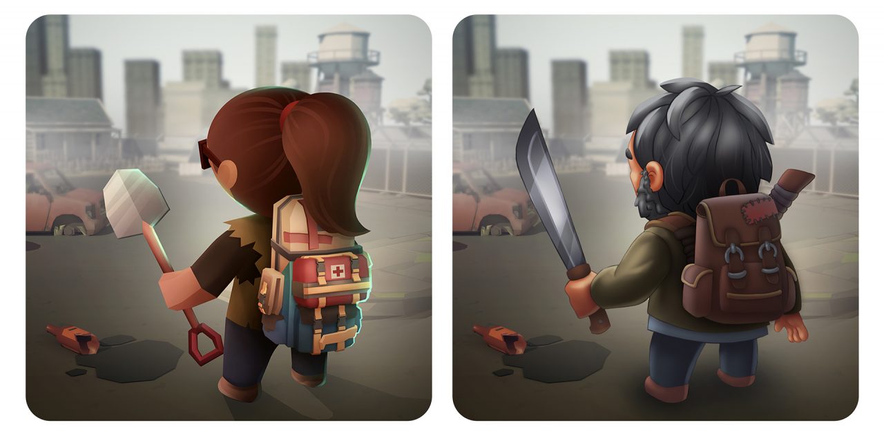
Even if we found a high-performing icon, the tests don’t stop there. For Abandoned City Survival, the icon with a female character performed very well and bypassed all other options. But the reference to TLOU’s Joel brought an even bigger increase of 4.5%. You can assume that a male character is more appealing for the survival game audience.
BLOCKFIELD
And here you can witness a curious hype vs nostalgia battle.
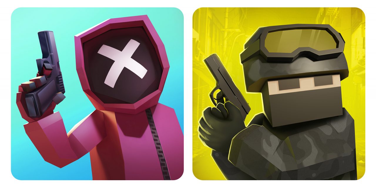
With a noticeable margin of 22-27%, the new icon where we referenced the Counter-Strike 1.6 lobby background won. One of the likely reasons is that the game has a lot of users from the CIS countries where Counter-Strike has been booming in popularity ever since the 1.6 version.
This time, no conclusion
ASO is a relatively new thing where trends and preferences change as quickly as the entire mobile market. The only way to stay on top is practice, observation, trend tracking, constant testing and analytics.
Unfortunately, making one icon, uploading a couple of screenshots to the page of the store and waiting for organic users to come in isn’t an option.
